Motivation
I recently needed to implement some time-series clustering at work on a high-dimensional dataset. Having not tackled this specific problem before, I wanted to practice on a smaller, univariate dataset where I already had a strong intuition about the underlying structure.
I turned to my exported Strava running data as a testbed to get familiar with clustering using Dynamic Time Warping (DTW).
Heartrate data
Show the code
library(tidyverse)
library(duckdb)
library(plotly)
library(dtw)
library(parallel)
library(tidytext)
library(ggwordcloud)
library(patchwork)
library(dendextend)
library(ggridges)
library(broom)
library(cluster)
I started by pulling data from my existing database, restricting the scope to runs that contain both heart rate and GPS location data.
Show the code
con <- dbConnect(duckdb(), "../running/data.db", read_only=TRUE)
df <- tbl(con, "activities") |>
    filter(activity_type == 'Run') |>
    inner_join(tbl(con, "heartrate"), by="activity_id") |>
    inner_join(tbl(con, "location"), by=c("activity_id", "time")) |>
    select(activity_id, start_time, name, time, heartrate, distance, duration) |>
    collect() |>
    group_by(activity_id) |>
    mutate(
        elapsed_time = as.numeric((time - min(time)) / 60)
    ) |>
    ungroup()
After filtering, I’m left with 1,192 runs—a solid sample size for this exercise.
Show the code
n_activities <- length(unique(df$activity_id))
n_activities
[1] 1192
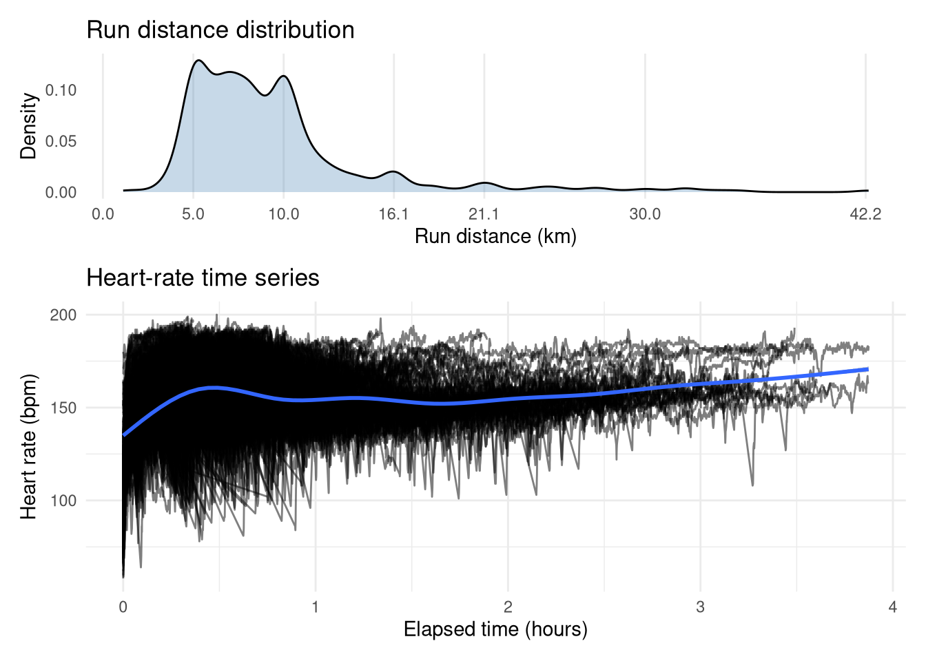
The top plot shows that the vast majority of my runs were between 5-10km, with spikes at lengths corresponding to race distances (e.g. 10 miles/16.1km, half-marathon/21.2km, marathon/42.2km). The time-series of my heart rate during these runs reveals some expected trends. There is a distinct hump up to 30 mins, suggesting a large volume of shorter, high-intensity runs, while longer efforts generally maintain a lower average heart rate, which makes sense as you can’t maintain a high heart rate for long. However, we can also observe the cardiac drift effect, whereby heart rate steadily climbs as the duration increases. The values themselves range from a cold start sub-100 bpm up to a flat-out 200 bpm (yikes!). There is a clear vertical gap between the longest runs, which I suspect is the difference between the marathon races (higher heart rate) and training runs (lower heart rate).
Show the code
p1 <- df |>
    distinct(activity_id, distance) |>
    ggplot(aes(x=distance)) +
        geom_density(fill="steelblue", alpha=0.3) +
        theme_minimal() +
        scale_x_continuous(breaks=c(0, 5, 10, 16.1, 21.1, 30, 42.2)) +
        labs(x="Run distance (km)", y="Density", title="Run distance distribution") +
        theme(
            panel.grid.major.y = element_blank(),
            panel.grid.minor.y = element_blank(),
            panel.grid.minor.x = element_blank(),
        )


p2 <- df |>
    mutate(elapsed_time = elapsed_time / 60) |>
    ggplot(aes(x=elapsed_time, y=heartrate)) +
        geom_line(aes(group=activity_id), alpha=0.5) +
        labs(x="Elapsed time (hours)", y="Heart rate (bpm)", title="Heart-rate time series") +
        stat_smooth() +
        theme_minimal()
p1 / p2 + plot_layout(heights=c(1, 2))
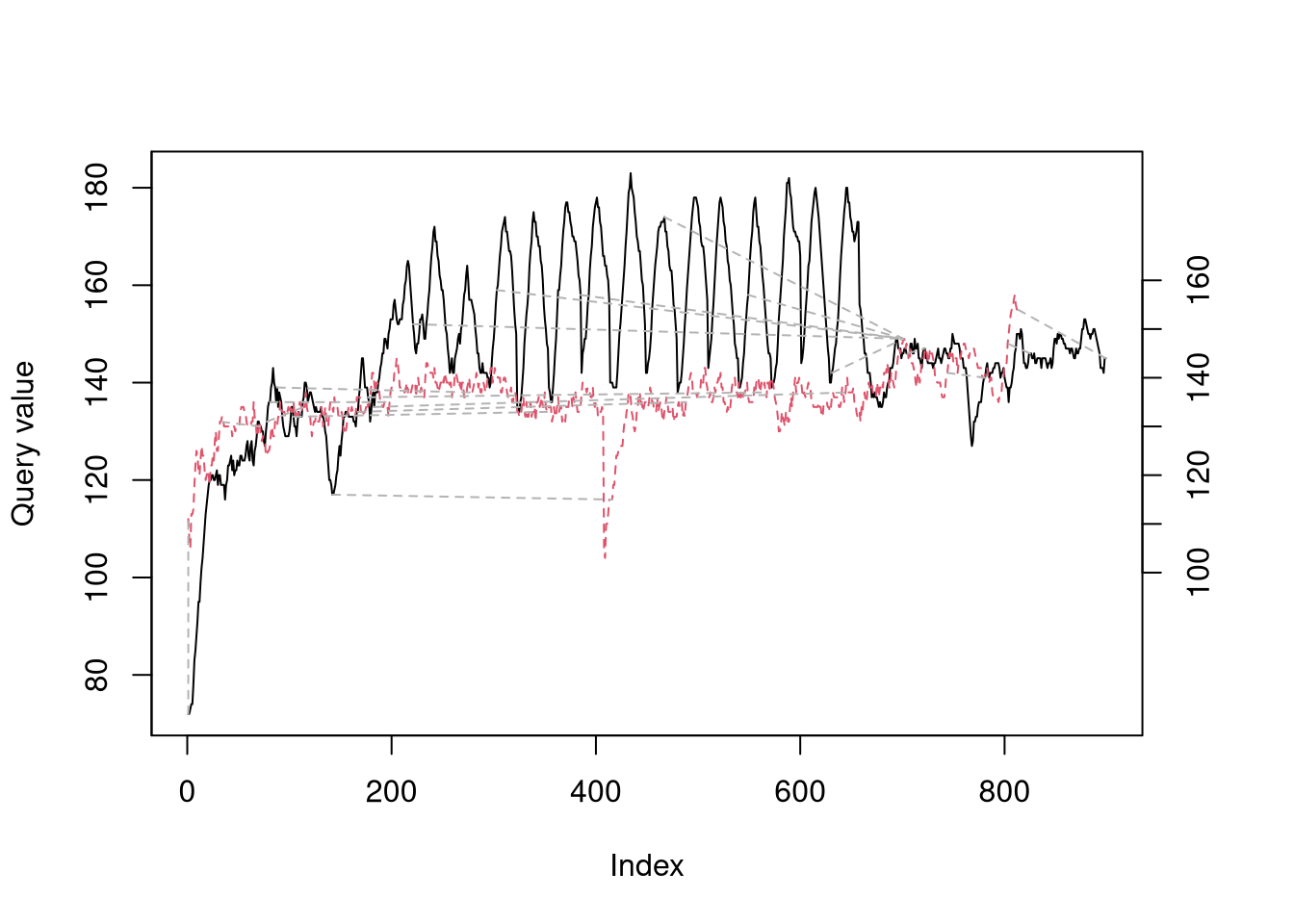
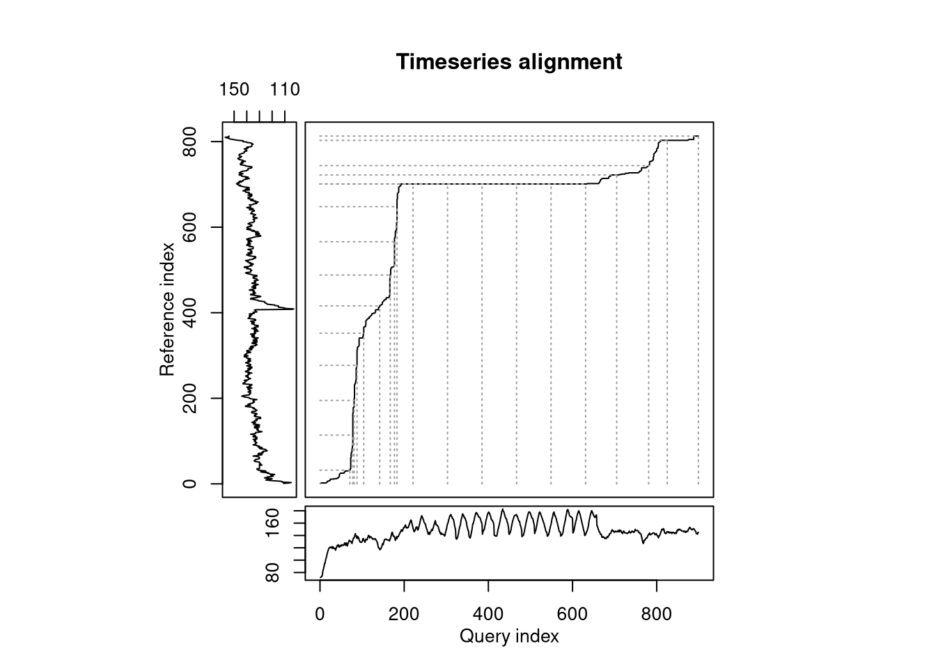
To illustrate what DTW is doing, let’s take 2 example runs that were both for 10km, however one was a hill sprint session (black in left-hand plot) and the other was an easy trail run (red in left-hand plot). My heartrate clearly is very different between the two, even if the baseline value (i.e. any time during the warm-up, cool down, or rest periods in the hill sprints) is almost identical. DTW is trying find a path between the time-series that minimizes the absolute distance while allowing time to be stretched to find the closest alignmnet. The series align quite nicely during the hill sprint warmup, but when the intervals start the alignment stays flat until they are over, as the algorithm identifies the entire duration of the intervals as aligning with a short period in the easy run. The overall ‘distance’ between the two runs is the total cost of this path and will be used as the pairwise distance measure for clustering.
Show the code
dtw_res <- dtw(ts_hills, ts_easy, k = TRUE)
plot(dtw_res, type = "twoway", off = 1, match.lty = 2, match.indices = 20)
plot(dtw_res, type = "threeway", match.indices = 20)
Preparing data for clustering
Clustering requires a distance matrix of all pairwise comparisons. Ideally we’d create a 2D matrix storing the heart-rate time-series for each run, but since each activity varies in duration we need to use a jagged array instead. In particular, I’ve stored the heart rate arrays in a named list.
Show the code
df_split <- lapply(split(df, df$activity_id), function(x) x$heartrate)
I then generated every possible pairwise combination (over 700,000!) of these runs using the built-in combn function stored in a 2D matrix, where each row corresponds to a different pairwise combintion and the 2 columns refer to the run’s index in the list.
Show the code
combs <- t(combn(length(df_split), 2))    # All combinations in terms of list indices
head(combs)
     [,1] [,2]
[1,]    1    2
[2,]    1    3
[3,]    1    4
[4,]    1    5
[5,]    1    6
[6,]    1    7
We’ll then iterate through each row of this matrix, calculating the DTW distance between each pair each time using the helper function below. Given the computational intensity, I ran this in parallel on a beefy machine, even then it takes some time!
Show the code
calc_dtw <- function(i, j) {
    dtw(df_split[[i]], df_split[[j]])$distance
}
Show the code
distances <- mclapply(
    1:nrow(combs),
    function(i) calc_dtw(combs[i, 1], combs[i, 2]), mc.cores=64
)
This 1D array of DTW distances can now be deserialized into a 2D matrix that can be converted to R’s built in dist type, representing distance matrices.
Show the code
distances <- unlist(distances) # mclapply returns a list, we need vector

# Generate an empty complete matrix and populate it
combs_mat <- matrix(NA, nrow=n_activities, ncol=n_activities)
for (i in 1:nrow(combs)) {
    combs_mat[combs[i, 1], combs[i, 2]] <- distances[i]
    combs_mat[combs[i, 2], combs[i, 1]] <- distances[i]  # Strictly redundant as as.dist later returns just lower triangle but necessary
}
diag(combs_mat) <- 0
dist_mat_hr <- as.dist(combs_mat)
Clustering runs
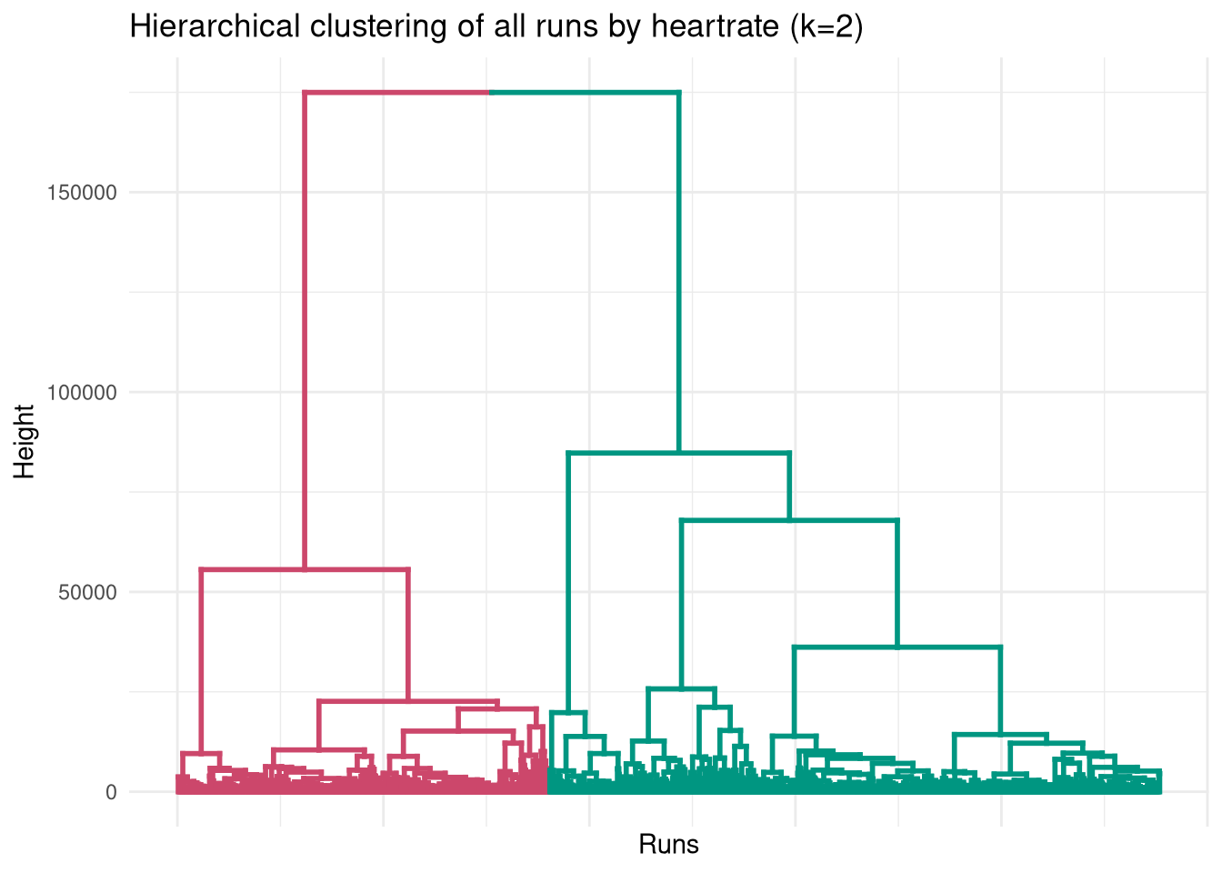
With the distance matrix populated, we can dive into the hierarchical clustering. Cutting the tree at k=2 reveals two very distinct behaviors in the data.
Show the code
clust <- hclust(dist_mat_hr, method="ward.D2")

# Extract dendrogram and colour branches
dend <- as.dendrogram(clust)
dend <- color_branches(dend, k = 2)
ggplot(dend, labels=FALSE) +
  labs(title = "Hierarchical clustering of all runs by heartrate (k=2)",
       x = "Runs",
       y = "Height") +
        theme_minimal() +
        theme(
            axis.text.x = element_blank()
        )
Show the code
df <- df |>
    inner_join(
        tibble(
            activity_id = as.numeric(names(df_split)),
            cluster_2 = factor(cutree(clust, k=2), levels=c(2, 1), labels=c("Chill", "High effort"))
        ), by="activity_id"
    )
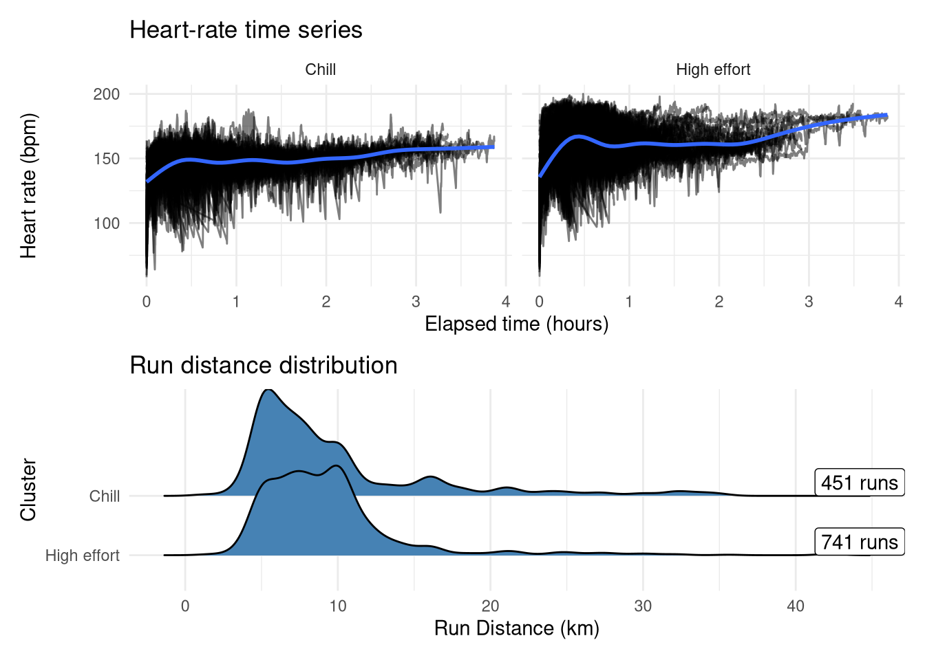
Interestingly, the run distances don’t differ drastically between these two groups at first glance, but Cluster 2 clearly holds the peak efforts (actual races and PB attempts) as exemplified by both the higher average heart-rate and the the bump at lower time-periods, whereas the other group has less variability around the cardiac drift. Interestingly there are more runs in the ‘high effort’ group despite my expectation being that intentional speedwork runs only comprise approximately a third of my total runs, so it could be the case that some longer runs(where heart rate will naturally be higher even without an explicit speed target) are getting assigned into the high effort group along with potentially some runs from when I was less fit where my baseline heart-rate would be higher.
Show the code
p1 <- df |>
    mutate(elapsed_time = elapsed_time / 60) |>
    ggplot(aes(x=elapsed_time, y=heartrate)) +
        geom_line(aes(group=activity_id), alpha=0.5) +
        labs(x="Elapsed time (hours)", y="Heart rate (bpm)", title="Heart-rate time series") +
        geom_smooth() +
        facet_wrap(~cluster_2) +
        theme_minimal()
p2 <- df |>
    distinct(activity_id, distance, cluster_2) |>
    mutate(cluster_2 = as.factor(cluster_2)) |>
    ggplot(aes(y=cluster_2, x=distance)) +
        geom_density_ridges(fill="steelblue") +
        scale_y_discrete(limits=rev) +
        geom_label(
            x=Inf,
            aes(label=label),
            hjust=1,
            vjust=0,
            data = df |>
                distinct(activity_id, cluster_2) |>
                count(cluster_2) |>
                mutate(label = sprintf("%d runs", n))
        ) +
        theme_minimal() +
        labs(y="Cluster", x="Run Distance (km)", title="Run distance distribution")
p1 / p2
Delving into the high effort group
When we expand to four clusters, the ‘high effort’ cluster (Cluster 2) splits into three sub-types, while the ‘chill’ cluster remains unchanged.
Show the code
dend <- color_branches(dend, k = 4)
ggplot(dend, labels=FALSE) +
  labs(title = "Hierarchical clustering of all runs by heartrate (k=4)",
       x = "Runs",
       y = "Height") +
        theme_minimal() +
        theme(
            axis.text.x = element_blank()
        )
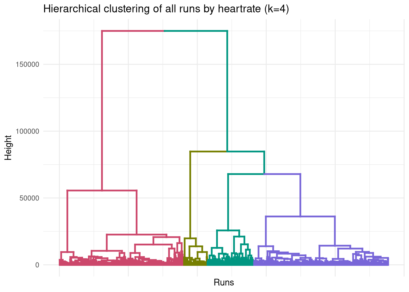
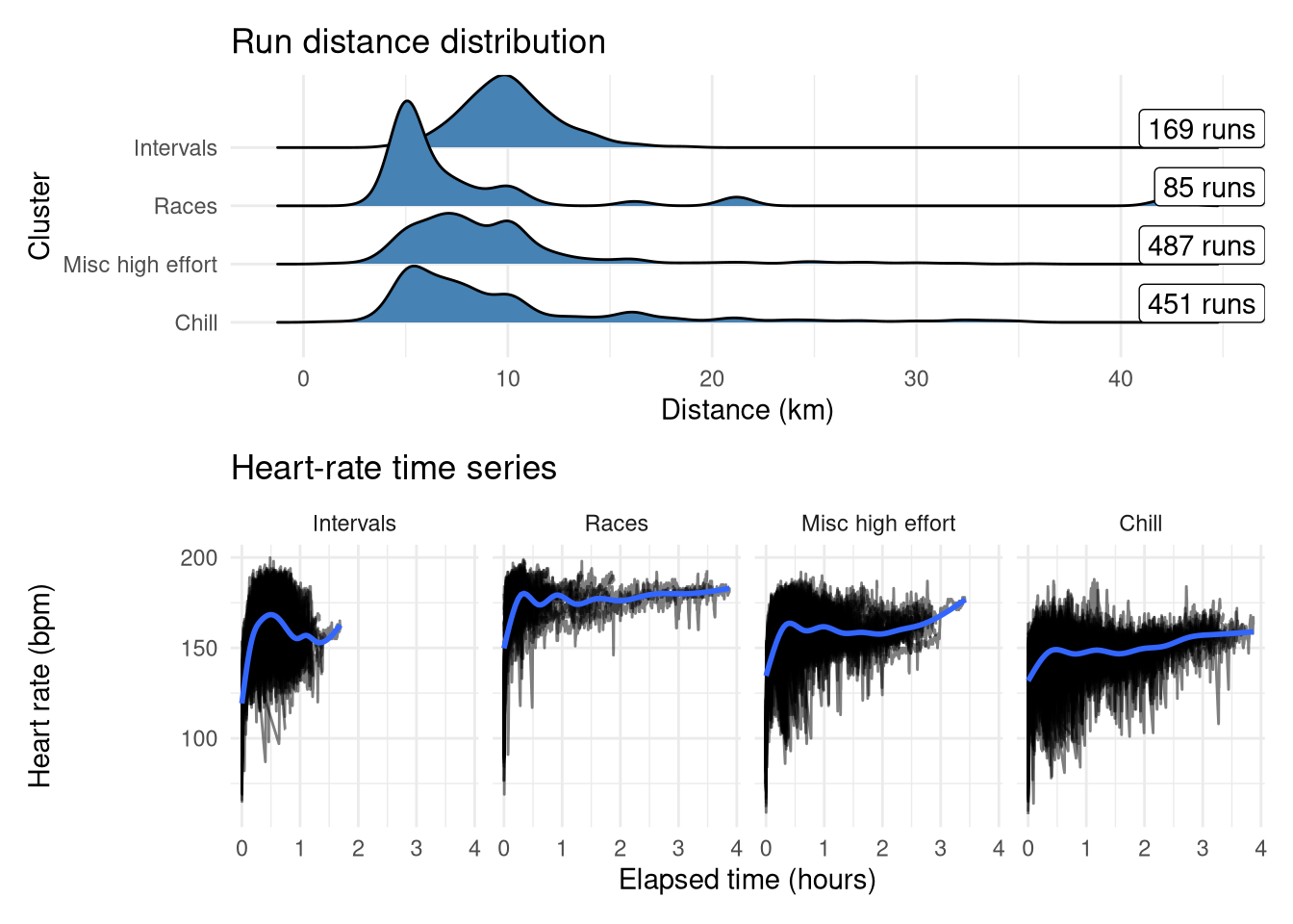
These have been reordered and renamed to make it easier to follow, and summarised in the plots below:
- ‘Intervals’ (second from right in dendrogram): Short sharp speed sessions with a median distance of 10km (generally my training runs would be ~4km total warmup/cooldown + ~6km intervals).
- ‘Races’ (second from left in dendrogram): Highest average heart rate and has some long distances, looks like it could represent max efforts
- ‘Misc high effort’ (rightmost in dendrogram): Catch-all group for any other higher-effort run. Similar profile to Chill but with higher average heart-rate and has that characteristic bump at low distances suggesting some short high-effort runs.
- ‘Chill’ (leftmost in dendrogram): The unchanged ‘chill’ group. Easyish runs across all distances
Show the code
df <- df |>
    inner_join(
        tibble(
            activity_id = as.numeric(names(df_split)),
            cluster_4 = factor(cutree(clust, k=4), levels=c(4, 2, 1, 3), labels=c("Intervals", "Races", "Misc high effort", "Chill"))
        ), by="activity_id"
    )
Show the code
p1 <- df |>
    mutate(elapsed_time = elapsed_time / 60) |>
    ggplot(aes(x=elapsed_time, y=heartrate)) +
        geom_line(aes(group=activity_id), alpha=0.5) +
        labs(x="Elapsed time (hours)", y="Heart rate (bpm)", title="Heart-rate time series") +
        geom_smooth() +
        facet_wrap(~cluster_4, nrow=1) +
        theme_minimal()

p2 <- df |>
    distinct(activity_id, distance, cluster_4) |>
    mutate(cluster_4 = as.factor(cluster_4)) |>
    ggplot(aes(y=cluster_4, x=distance)) +
        ggridges::geom_density_ridges(fill="steelblue") +
        scale_y_discrete(limits=rev) +
        geom_label(
            x=Inf,
            aes(label=label),
            hjust=1,
            vjust=0,
            data = df |>
                distinct(activity_id, cluster_4) |>
                count(cluster_4) |>
                mutate(label = sprintf("%d runs", n))
        ) +
        theme_minimal() +
        labs(y="Cluster", x="Distance (km)", title="Run distance distribution")

p2 / p1
Validating clusters
Unlike many fields in statistics, in clustering there is little internal validation to be done. There is no ‘outcome’ to use to see how well the model explains the training data - instead we need to validate it externally with other data that wasn’t used for the clustering. For this dataset, one obvious source of metadata is the run title on Strava, used for either categorization or to fit as many emojis in as possible. I don’t title all my runs, but I generally do try and rename my explicit speedwork runs so I can locate them later on. We can also look at the heart-rate profile of these runs in more detail to see if there are some intra-cluster trends.
Internal validation
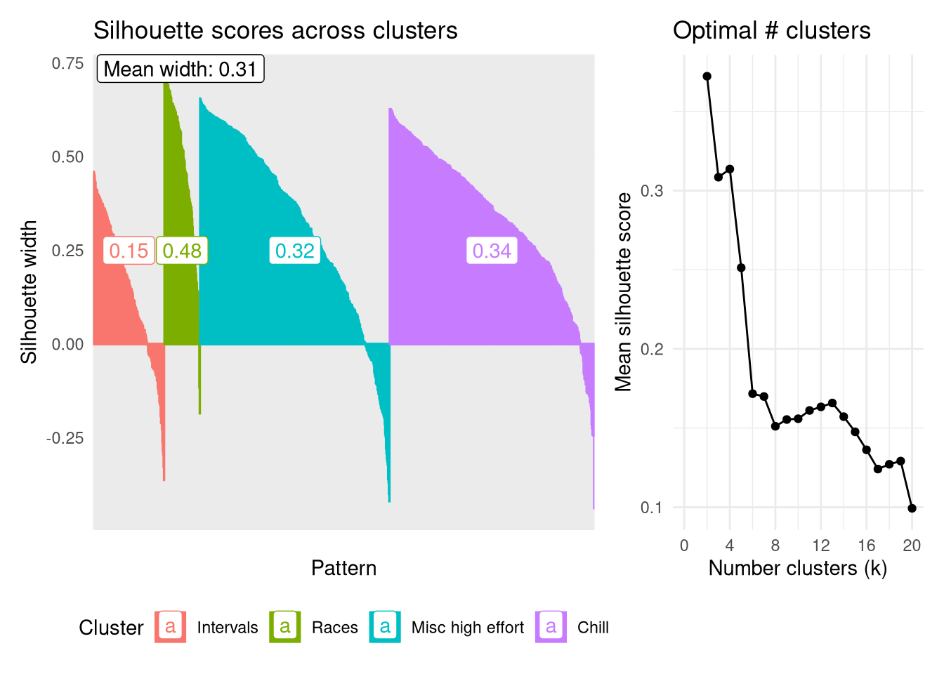
Firstly though, let’s look at the internal validation using the silhouette score to assess the robustness of each cluster as well as identifying the ‘optimal’ number of clusters. The plot below shows the scores for each datapoint, represented by narrow columns, ordered by groups and silhouette score. A rough guide is the higher the silhouette score the better that point fits into its assigned cluster, while negative numbers indicate the point might fit better in an alternative group.
The most robust group is the Races group, having the highest average silhouette width of 0.48. This is the least populous group which helps to keep it focused. Interestingly the ‘chill’ group is the next most robust, followed by ‘Misc high effort’, despite both of these looking very similar in terms of their temporal heart rate signatures, and the latter being more of a catch-all group rather than having a specific focus.
Calculating the mean Silhouette width across all clusters for values of $k$ from 2 - 20 shows that partitioning the dendrogram at k=2 produces the most robust clusters on average, followed by 4. I’ll stick with analyzing the four clusters as this further stratification has the possibility to tease out some interesting trends.
Show the code
sil <- silhouette(cutree(clust, k = 4), dist_mat_hr)
sil_df <- as_tibble(sil) |>
    mutate(
        Cluster = factor(cluster, levels=c(4, 2, 3, 1), labels=c("Intervals", "Races", "Misc high effort", "Chill")),
        neighbor = factor(neighbor, levels=c(4, 2, 3, 1), labels=c("Intervals", "Races", "Misc high effort", "Chill")),
        i = row_number()
    ) |>
    arrange(Cluster, desc(sil_width))
p1 <- sil_df |>
    mutate(
        i = factor(i, levels=sil_df$i)
    ) |>
    ggplot(aes(x=i, y=sil_width, colour=Cluster)) +
        geom_col(aes(fill=Cluster)) +
        annotate("label", x=10, y=Inf, label=sprintf("Mean width: %.2f", mean(sil_df$sil_width)), hjust=0, vjust=1) +
        geom_label(
            aes(x=i, y=0.25, label=group_width, colour=Cluster),
            data = sil_df |>
                group_by(Cluster) |>
                mutate(
                    j = row_number(),
                    group_width = round(mean(sil_width), 2),
                ) |>
                filter(j == median(j)) |>
                mutate(i = factor(i, levels=sil_df$i))
        ) +
        theme_minimal() +
        labs(x="Pattern", y="Silhouette width", title="Silhouette scores across clusters") +
        theme(
            legend.position="bottom",
            axis.text.x = element_blank()
        )
p2 <- tibble(
    k = 2:20,
    sil = sapply(k, function(i) mean(silhouette(cutree(clust, k = i), dist_mat_hr)[, 3]))
) |>
    ggplot(aes(x=k, y=sil)) +
        geom_point() +
        geom_line() +
        theme_minimal() +
        theme(

        ) +
        scale_x_continuous(breaks=seq(0, 20, by=4),
                           limits=c(0, 20)) +
        labs(x="Number clusters (k)", y="Mean silhouette score", title="Optimal # clusters")
p1 + p2 + plot_layout(widths=c(2, 1))
Validating with run titles
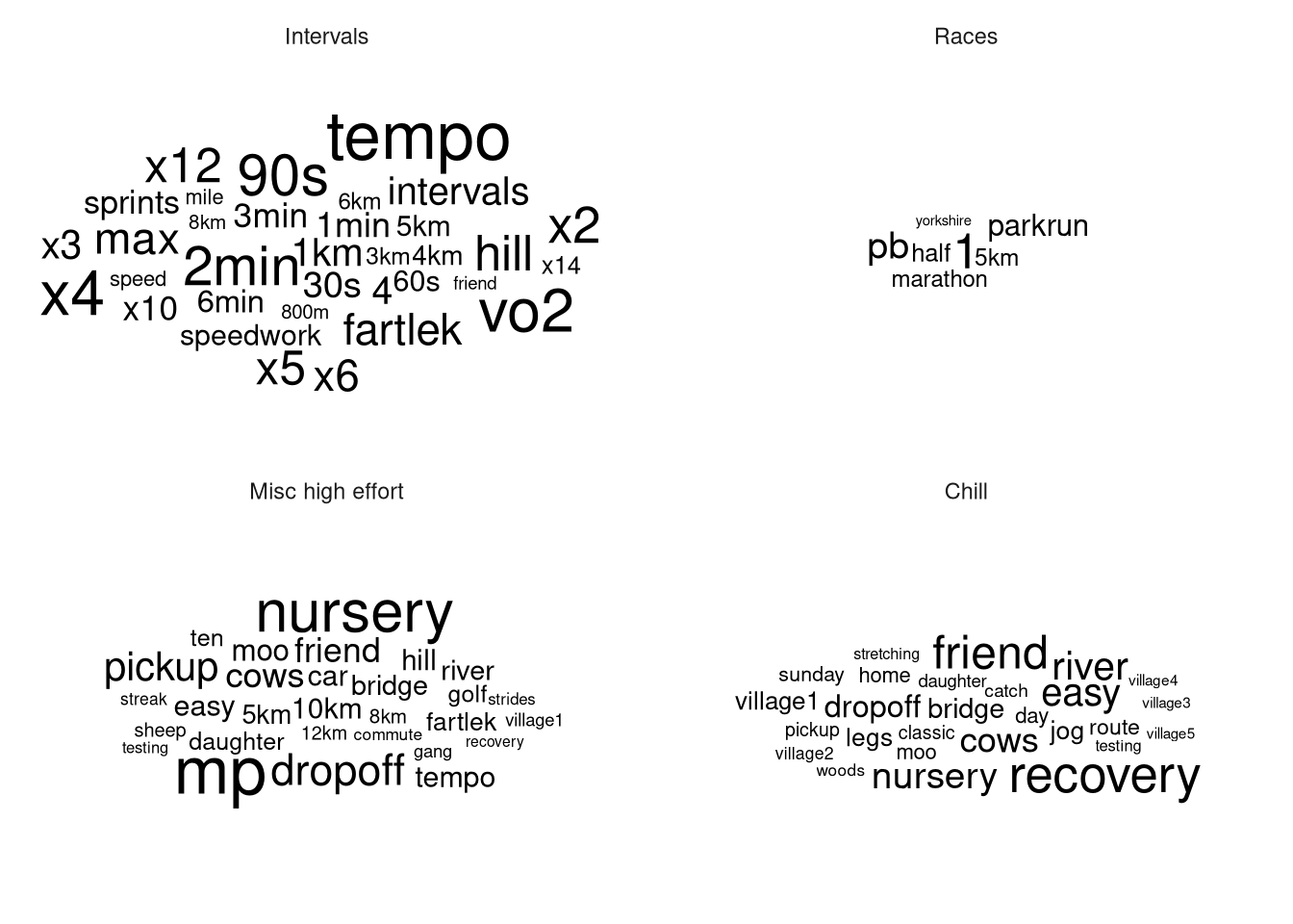
The names of these runs as listed on Strava is the closest thing to a ‘ground-truth’ as these (often but not always) convey the motivation behind the run, which is what I’m hoping the clustering will automatically be able to pick out. I am limited here in that I only tend to name a run when it’s a speedwork session or the route is particularly interesting, but it’s bette than nothing. After some regex-heavy cleaning to standardize my shorthand (like “5x1k” vs “1km x 5”), we can look at the resultant word clouds, filtered to words that occur at least 3 times and removing Strava’s auto-generated titles (“Lunch Run”, “Morning Run”, etc…).
Show the code
words <- df |>
    distinct(activity_id, name) |>
    # Tedious cleaning to get x into standard form
    mutate(
        name = str_replace_all(name, "(\\d+)x(\\d+)km?", "x\\1 \\2km"),
        name = str_replace_all(name, "(\\d+)x(\\d+)min", "x\\1 \\2min"),
        name = str_replace_all(name, "(\\d+)x(\\d+)m", "x\\1 \\2m"),
        name = str_replace_all(name, "(\\d+)x(\\d+)s", "x\\1 \\2s"),
        name = str_replace_all(name, "(\\d+)km?x(\\d+)", "x\\2 \\1km"),
        name = str_replace_all(name, "(\\d+)minx(\\d+)", "x\\2 \\1min"),
        name = str_replace_all(name, "(\\d+)mx(\\d+)", "x\\2 \\1m"),
        name = str_replace_all(name, "(\\d+)sx(\\d+)", "x\\2 \\1s"),
    ) |>
    unnest_tokens(word, name) |>
    anti_join(stop_words, by = "word") |>  # remove stop words
    # Remove words that Strava automatically adds
    filter(
        word != 'run',
        !word %in% c('run', 'morning', 'lunch', 'afternoon', 'evening')
    )
The text analysis beautifully validates the clusters. The ‘Races’ cluster is dominated by ‘PB’ and words indicating races, such as ‘parkrun’, ‘half’, ‘marathon’, ‘yorkshire’ (part of ‘Yorkshire Marathon’) and the ‘Intervals’ group is littered with durations and multipliers like ‘30s’, ‘x4’ as used in my interval-based training run titles.
Meanwhile the Misc cluster has two main types of runs present: Nursery pickup/dropoffs with the running stroller, and slower speedworks such as tempo and marathon pace (MP) runs where I’m running at a continuous pace rather than at intervals. The latter suggests that DTW is detecting a difference between the high-variability of my heart rate in an interval session as compared to a continuous speed workout. It’s not a huge surprise to see nursery runs represented here as while my pace would have been slow, my heart rate would have increased due to the additional exertion of pushing a child in a stroller.
Meanwhile the ‘Chill’ group is represented by terms reflecting low effort runs such as ‘recovery’, ‘friend’, ‘easy’, as well as the numerous geographic terms suggesting countryside trail runs (village1, ‘village2’, river, bridge, moo).
Show the code
df |>
    distinct(activity_id, cluster_4) |>
    inner_join(words, by="activity_id") |>
    count(cluster_4, word) |>
    ungroup() |>
    group_by(cluster_4) |>
    filter(n >= 3) |>
    ungroup() |>
    ggplot(aes(label=word, size=n)) +
        geom_text_wordcloud_area() +
        scale_size_area(max_size=20) +
        facet_wrap(~cluster_4) +
        theme_minimal()
Heart-rate metrics
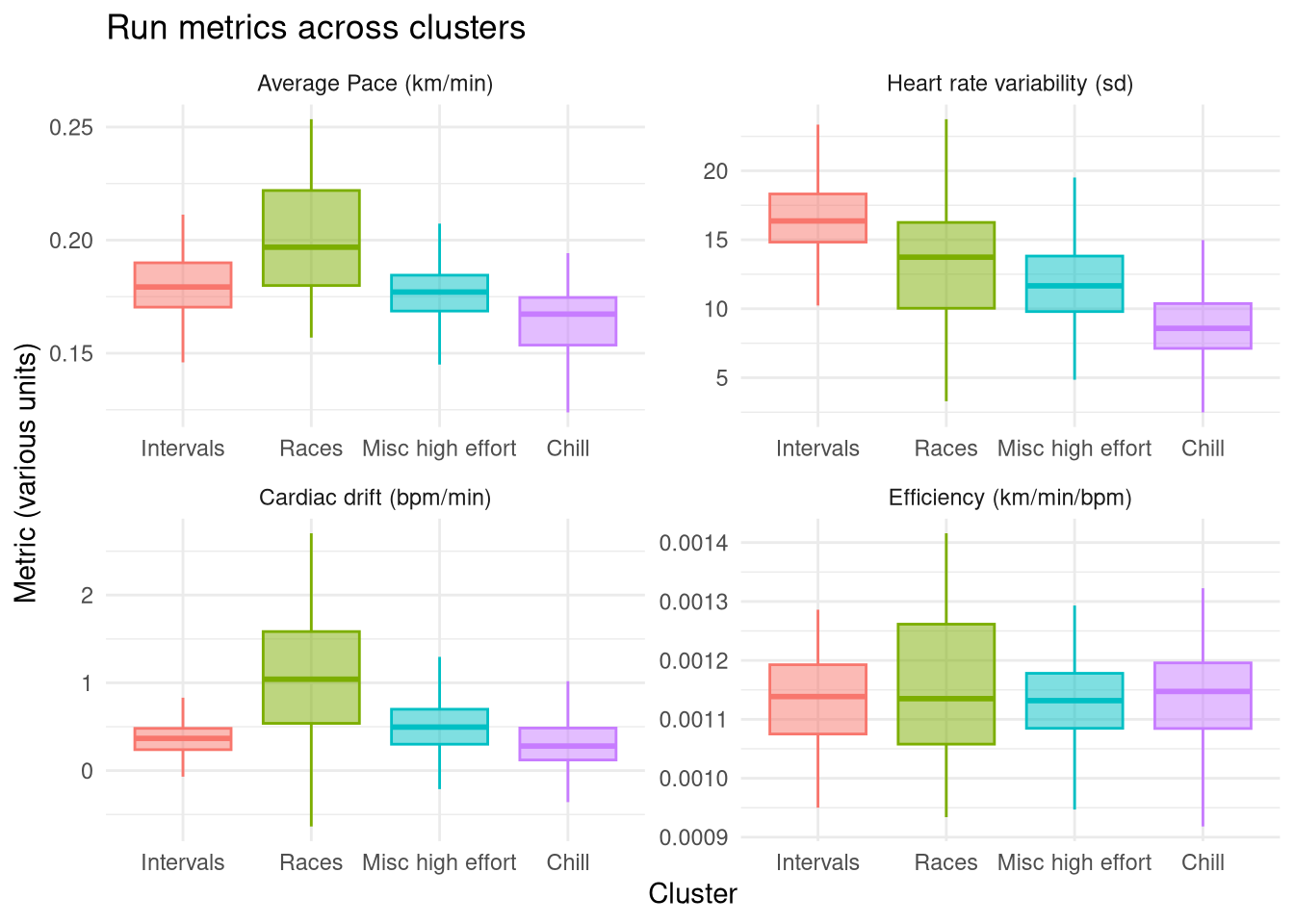
The next form of external validation is to compare the identified clusters on some key run metrics:
- Average pace (total distance / total time)
- Heart rate variability (standard deviation of heart rate)
- Cardiac drift (slope of a linear regression of heart rate vs time)
- Cardiac efficiency (average pace / average heart rate - a rough measure of cardiac fitness)
These are summarised in the plot below and reinforce that the Races group is definitely the highest effort group as exemplified by the highest average pace and the highest cardiac drift, caused by running at maximum effort. This group’s heart rate variability isn’t particularly high, because my race strategy is to run even splits (a grandiose term for running at max effort til I collapse). In contrast, the Intervals group unsurprisingly has the highest heart rate variability, while its average pace isn’t especially high as the high intensity intervals are interleaved with periods of rest.
The Misc catch-all group is a balance between these two more focused high effort groups, allthough it has a higher average pace and variability than the Chill group demonstrating why it is a separate group. By contrast the Chill group has the lowest average pace, the lowest heart rate variability, and the lowest drift, indicative of a consistently low effort easy run.
The Efficiency metric doesn’t show any noticeable differences between groups. I was hoping to see a slight increase in the Race group (as I’d generally run a race at the end of a training program when my fitness is at a local maxima) and decrease in the Chill group (as these will include runs outside of training programs where my fitness might be lower). There are a few Races with higher efficiency but it isn’t enough to bring the average up more than other groups.
Show the code
drift_analysis <- df |>
  group_by(activity_id, cluster_4) |>
  do(tidy(lm(heartrate ~ elapsed_time, data = .))) |>
  filter(term == "elapsed_time") |>
  select(activity_id, cluster_4, slope = estimate) |>
  ungroup()

df |>
    mutate(
        duration = duration / 60  # Duration from seconds to minutes
    ) |>
    group_by(cluster_4, activity_id, distance, duration) |>
    summarise(
        hr_sd = sd(heartrate),
        avg_hr = mean(heartrate),
    ) |>
    ungroup() |>
    mutate(
        pace = distance / duration,
        efficiency = pace / avg_hr
    ) |>
    ungroup() |>
    inner_join(drift_analysis, by=c("activity_id", "cluster_4")) |>
    select(activity_id, cluster_4, hr_sd, slope, efficiency, pace) |>
    pivot_longer(-c(activity_id, cluster_4)) |>
    mutate(
        name = factor(
            name,
            levels=c("pace", "hr_sd", "slope", "efficiency"),
            labels=c("Average Pace (km/min)", "Heart rate variability (sd)", "Cardiac drift (bpm/min)", "Efficiency (km/min/bpm)")
        )
    ) |>
    ggplot(aes(x=cluster_4, y=value, fill=cluster_4, colour=cluster_4)) +
        #geom_point(alpha=0.3, density="distribution", position="jitter") +
        geom_boxplot(alpha=0.5, outliers = FALSE) +
        facet_wrap(~name, scales="free") +
        theme_minimal() +
        guides(fill="none", colour="none") +
        labs(
            x="Cluster", y="Metric (various units)", title="Run metrics across clusters"
        )
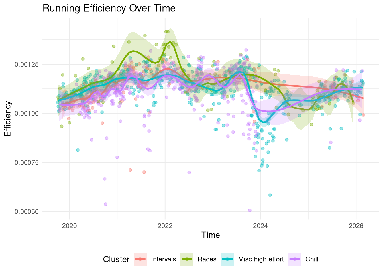
In order to better understand the Efficiency metric I’ve plotted all my runs on a time-series below against their efficiency score, coloured by cluster. Firstly, the plot indeed doesn’t show a large difference between clusters with the exception of some races in 2021-2022 which have a higher efficiency than other runs in the same time-frame. This correlates with my most intensive training period. If I manually restricted the Race group to actual timed events then I expect it would have a higher than average efficiency but given that it contains 85 runs it will also contain some hard training events where I’m not going flat out that will bring the average down.
The main observation is that the efficiency metric broadly captures the global trend well: I started more intensively training in 2019 (I’d been running for a couple years prior but this is when I bought my first heart-rate tracker) and my fitness steadily increased and peaked between 2021-2022, after which it started to drop off except for an intense marathon training block in the summer of 2023. I took some time off in autumn 2023 following which there are some very low efficiency runs around the 2024 new year, then an extended break until I started training again in 2025 but not to the same intensity level from 2021-2022.
Show the code
df |>
    mutate(
        duration = duration / 60  # Duration from seconds to minutes
    ) |>
    group_by(activity_id, start_time, Cluster=cluster_4, duration, distance) |>
    summarise(
      avg_hr = mean(heartrate),
    ) |>
    ungroup() |>
    mutate(
      pace = distance / duration,
      efficiency = pace / avg_hr,
    ) |>
    ggplot(aes(x=start_time, y=efficiency)) +
      geom_point(aes(colour=Cluster), alpha = 0.4) +
      geom_smooth(aes(colour=Cluster, fill=Cluster), span=0.2, alpha=0.2) +
      labs(title = "Running Efficiency Over Time",
           x = "Time", y = "Efficiency") +
      theme_minimal() +
      theme(
          legend.position = "bottom"
      )